HotelArc is a hotel booking app where travellers can search and book hotel rooms online. It covers hotels and resorts across preferred cities and nearby locations. The project was self-initiated — I set the brief, ran the research, and took the design from concept through to a complete UI and design system.
The brief came from a simple observation: hotel booking is something almost everyone does, yet almost everyone finds it frustrating. I wanted to understand why, and design something that actually addressed the root causes rather than adding more features on top of a broken experience.
Product Design, Visual Design, Design System, User Flows, Prototyping
Tech Stack
Figma
2022
Hotel booking apps have a trust problem.
Most of them surface a lot of information but very little clarity. Prices change without explanation. Policies are buried in fine print. Photos don't match reality. Filters return irrelevant results. And by the time a user reaches the payment screen, they're not confident — they're just tired of looking.
The problem isn't a lack of options. There are hundreds of hotels available on any given search. The problem is that users can't tell which option is actually right for them, and the apps aren't designed to help them figure that out. They're designed to show volume, not build confidence.
This leads to two outcomes that are both bad for users and bad for business. Either users abandon before booking because they don't trust what they're seeing. Or they book with anxiety, second-guess themselves, and feel let down if something doesn't match their expectations.
HotelArc was designed to fix the trust gap — not by simplifying away useful information, but by presenting it in a way that actually helps people make a decision they feel good about.
The project had four clear goals going in:
Transparency first.
Pricing, policies, and availability needed to be surfaced clearly and early — not revealed as surprises at the payment step. Users should know what they're paying and what happens if plans change before they commit.
The goal wasn't to show less — it was to show the right things at the right time. Hotel detail pages needed to lead with what users actually use to make decisions: photos, reviews, and price. Everything else could sit further down.
From the moment a user opens the app to the moment they receive confirmation, every step should feel like a natural continuation of the last. No confusing navigation, no unclear next actions, no moments where the user has to figure out what to do.
A complete component library and style guide was part of the brief from the start, so the UI could scale consistently if the product were taken further.
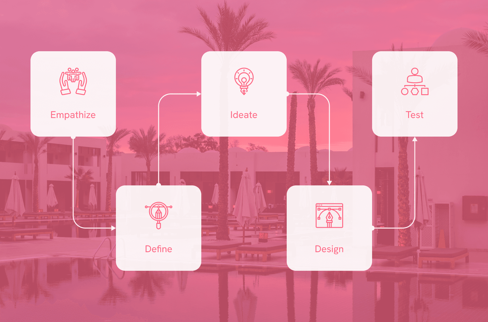
The project followed the design thinking framework across five stages. Each stage informed the next, keeping user needs at the centre of every decision rather than jumping straight to visuals.
User Research
To understand my users I conducted interviews and competitive analysis. I reviewed how existing booking apps handled the core experience and where they consistently fell short. Most apps surfaced the same data but failed at presentation — users couldn't find the right hotel combination quickly, and clarity on pricing and policies was almost always missing.
I also read reports on stress factors in travel planning and mapped gaps in the market. The research pointed to two consistent problems: interfaces that were too cluttered, and an almost universal absence of transparent booking information.

What factors influence your decision when choosing accommodation?
What improvements would make the booking process more efficient?
Have you used other hotel booking apps before?
What specific features do you look for when booking?
User Journey Map

Ashwin, 32 — Accountant, married
Ashwin is a busy person who lives with his family. His wife loves travelling but high demand in summer means hotel rooms sell out quickly before he can commit. He needs an app with a better system.
Goals:
Safety and comfort in travel
Finding the best hotel for his family
Getting detailed information to plan ahead
Expectations:
Clear payment procedures and confirmation processes
Mobile-responsive design
Features like loyalty programs and personalised recommendations
Pain Points:
No refund policy
Availability and pricing issues
Difficulty booking during peak seasons

Vishal, 26 — Student, single
Vishal believes life is short and should be enjoyed fully. He visits different locations with friends and family often. Finding and booking the best hotel or resort quickly would mean the world to him.
Goals:
Easy and clean booking experience
Finding the best deals
Browsing domestic and international locations
Expectations:
Clear disclosure of features and amenities
Rooms and resorts included, not just hotels
Good customer support
Pain Points:
Complicated booking systems
Overwhelmed by too many choices
No refund policy


User Journey Map
Mapped across four stages to identify where the experience breaks down and where the biggest opportunities sit.
Wireframes
Wireframes focused on structure and hierarchy before any visual decisions were made. The priority was getting the right information in the right place at the right time.
Key decisions at this stage:
Home screen leads with exploration, not a search bar
Reviews and photos sit above the fold on hotel detail pages
Payment is a single summary view, not a multi-step form
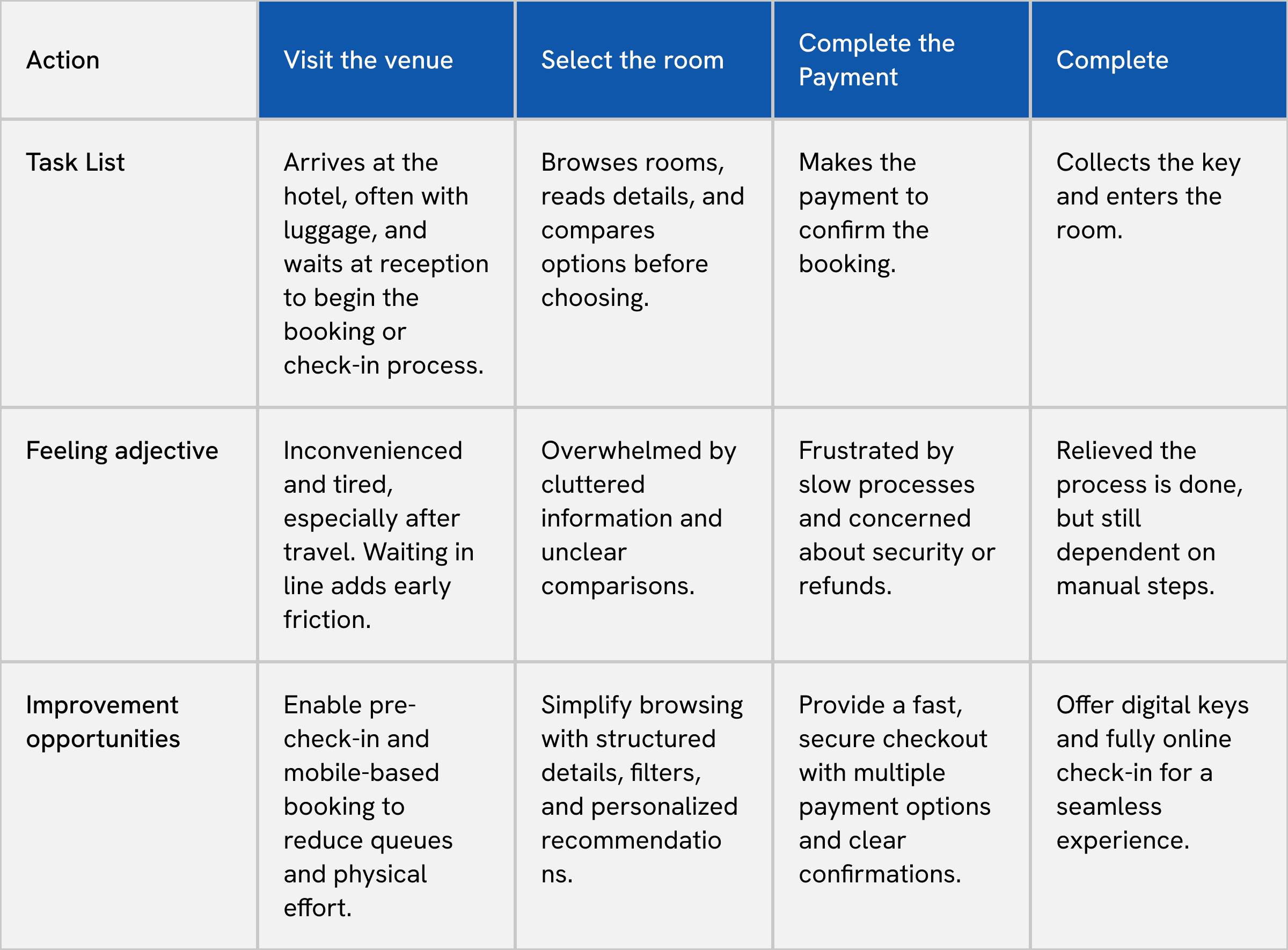
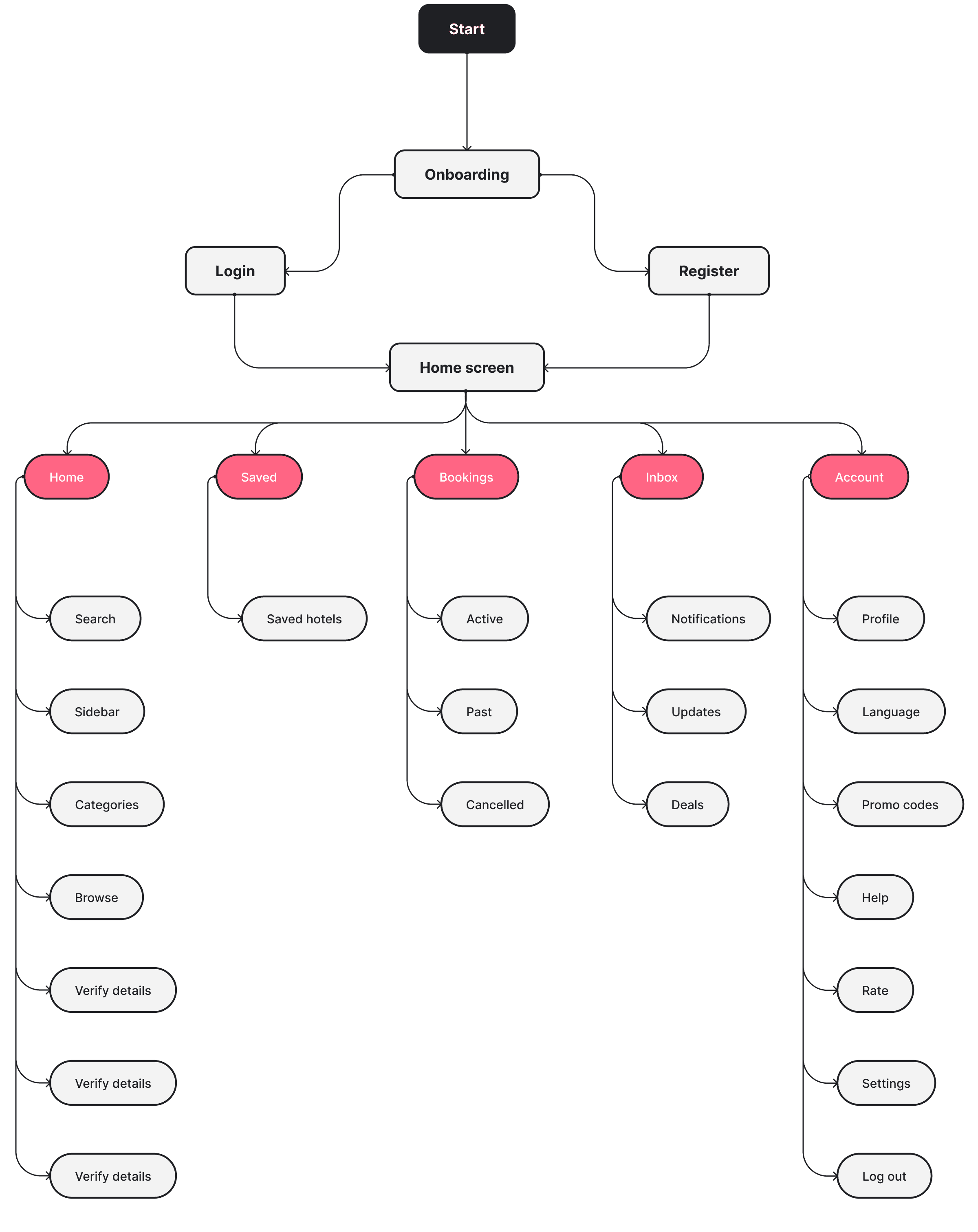
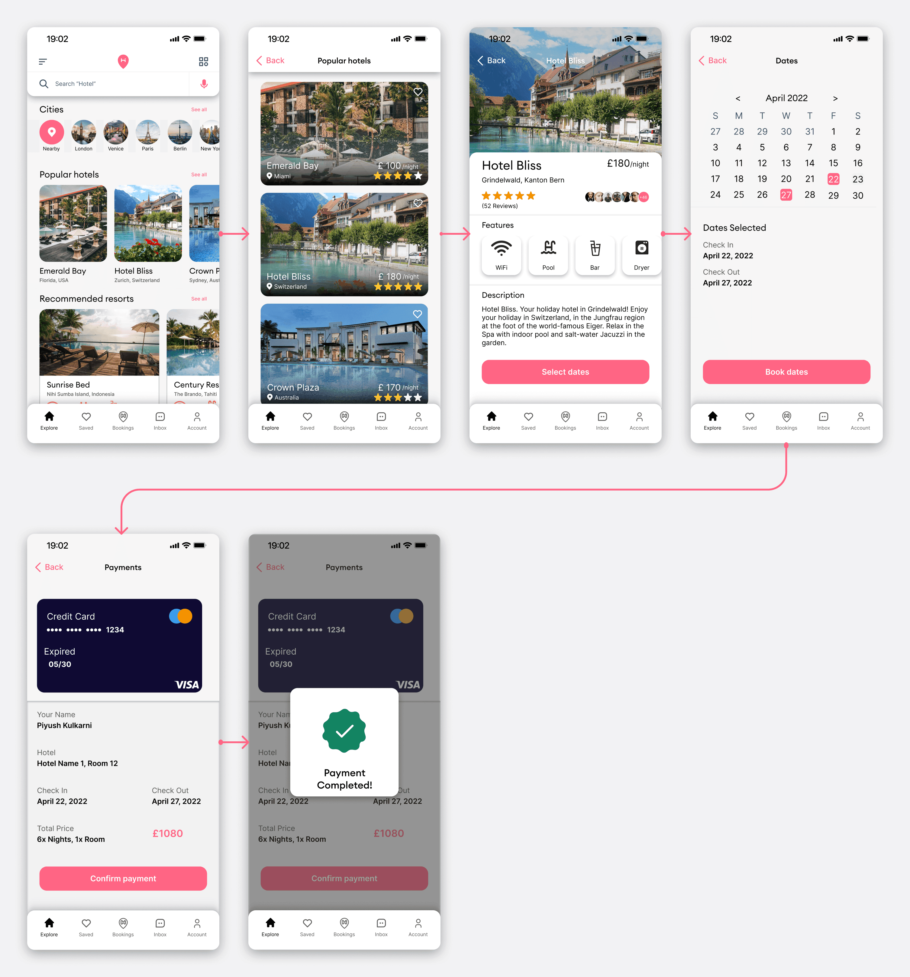
Moving from wireframes to refined screens, the focus shifted to reducing friction. Controls that weren't immediately needed were pulled back. Navigation was simplified to five tabs accessible from every screen. Search and filter interactions were designed to feel fast and uninterruptive.
Prototype
The prototype was built in Figma covering the full user journey from onboarding through to payment confirmation.
Testing focused on the two highest-friction moments from the research — search and hotel detail — to check that pricing transparency and information hierarchy had been addressed properly. Feedback from testing shaped final refinements to navigation structure and the payment summary screen.
User Interface
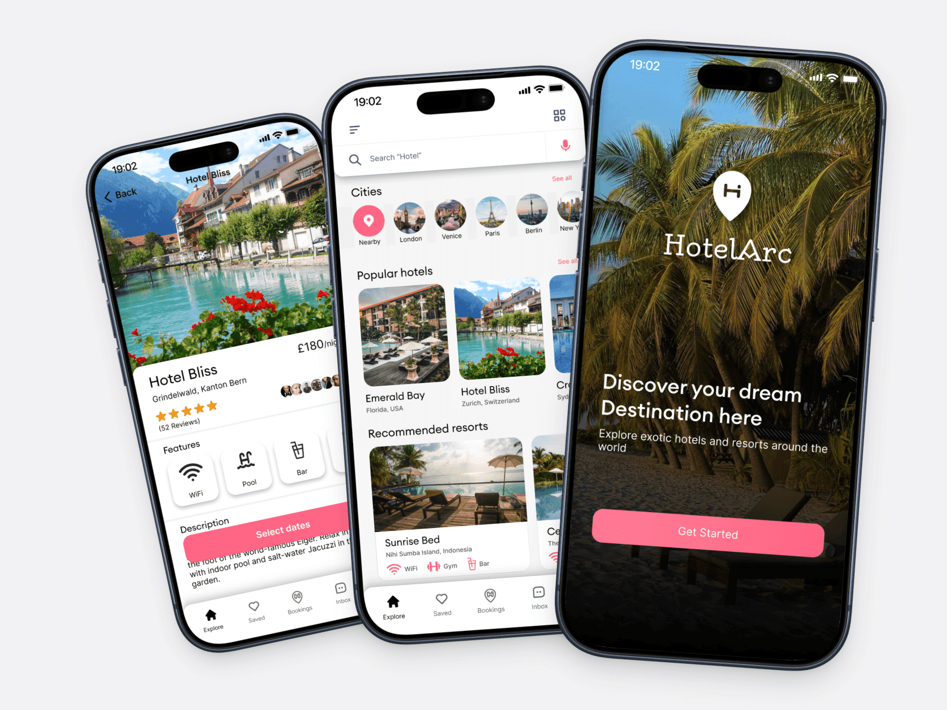
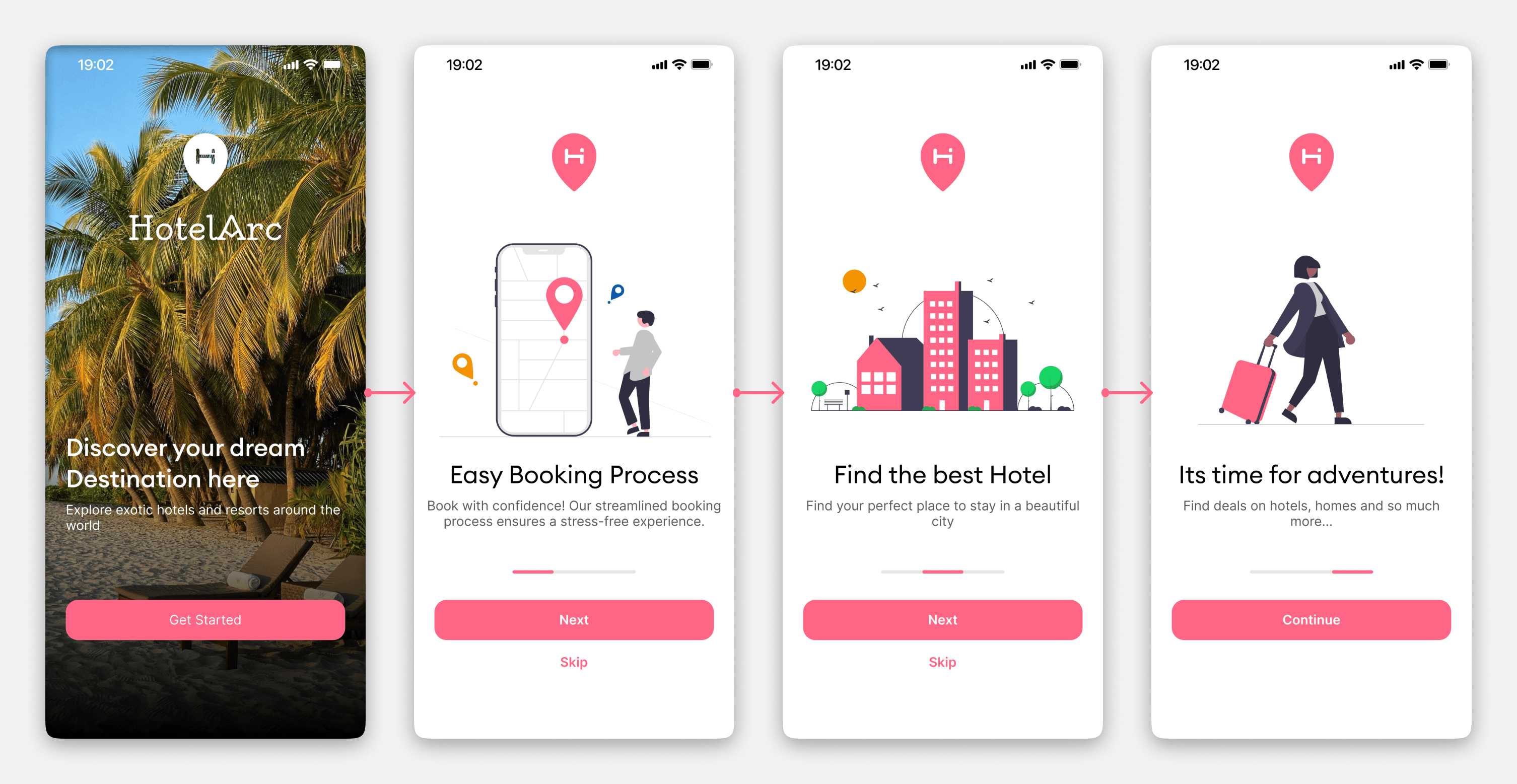
Onboarding Flow:
The onboarding introduces HotelArc's core value across three screens without asking for anything upfront. Each screen communicates a single idea clearly so users arrive at signup already oriented.
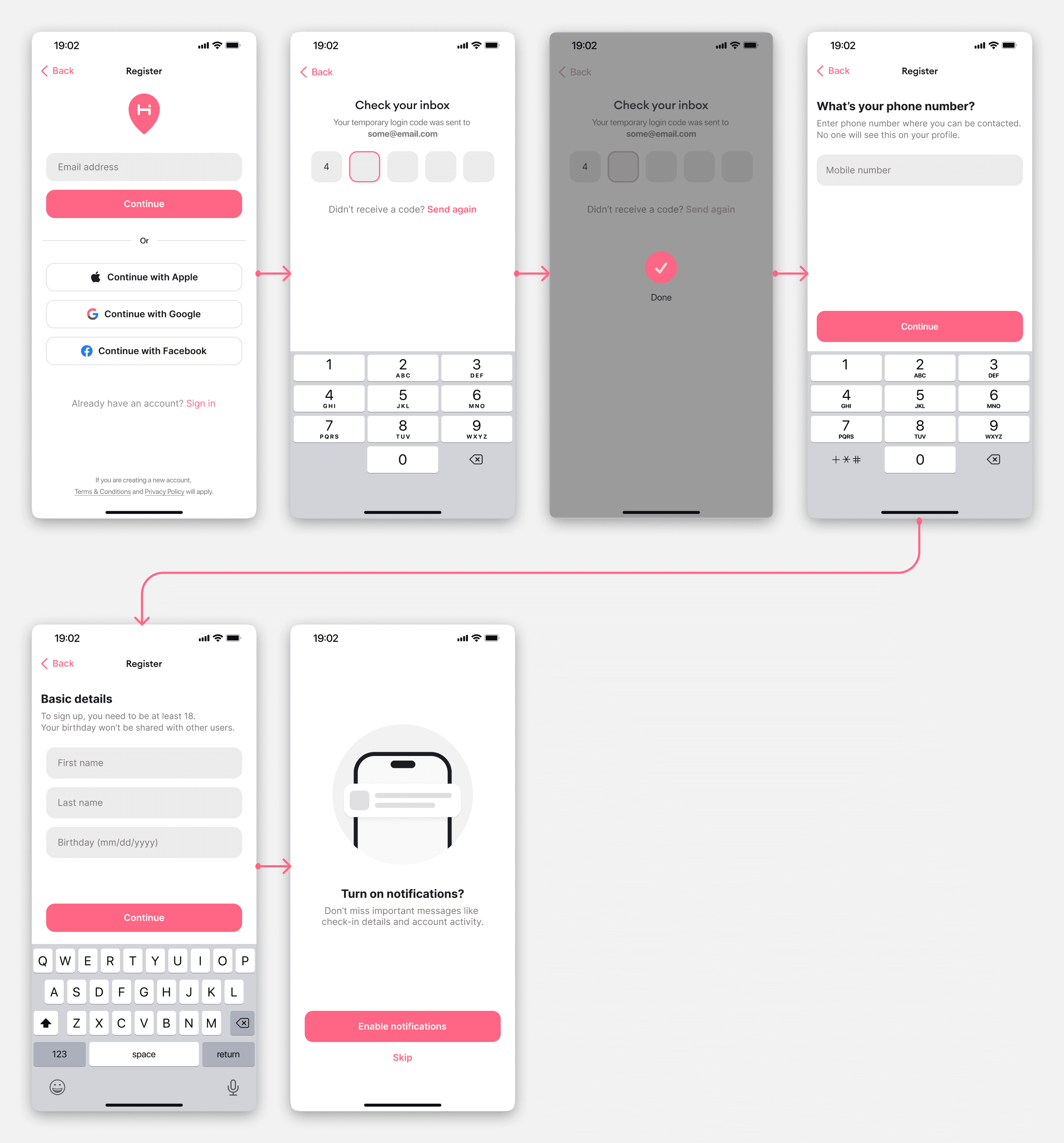
Signup and Sign In:
Sign up offers Apple, Google, and Facebook login to reduce the commitment barrier. For users who prefer email, the flow is short — verify, enter name, enter number, proceed. No unnecessary steps.
Booking Flow — Home to Payment
The home screen leads with cities, popular hotels, and recommended resorts — exploration first, search second. From there users can browse, check availability, select a room, choose dates, and confirm payment in a linear flow with no dead ends.
The hotel detail page prioritises photos and reviews above the fold. Pricing and room selection sit below without being buried. The payment screen shows a full summary before confirmation — hotel name, check-in, check-out, total price — so there are no surprises at the last step.
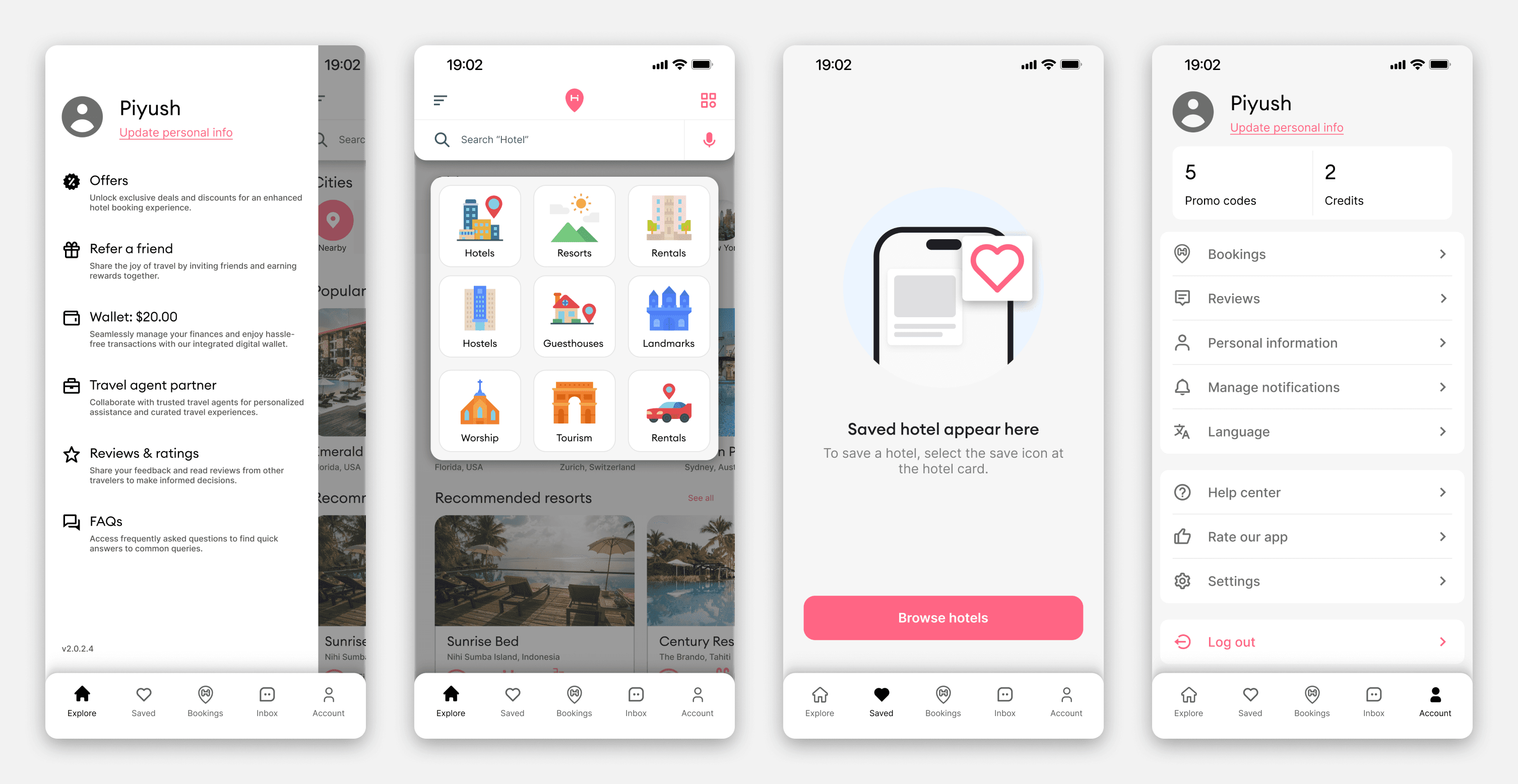
Additional Screens
Profile, saved hotels, explore by category, and account settings round out the full product. The saved hotels empty state was designed to feel encouraging rather than blank — guiding users back to browsing rather than leaving them on a dead screen.
Design System
Components
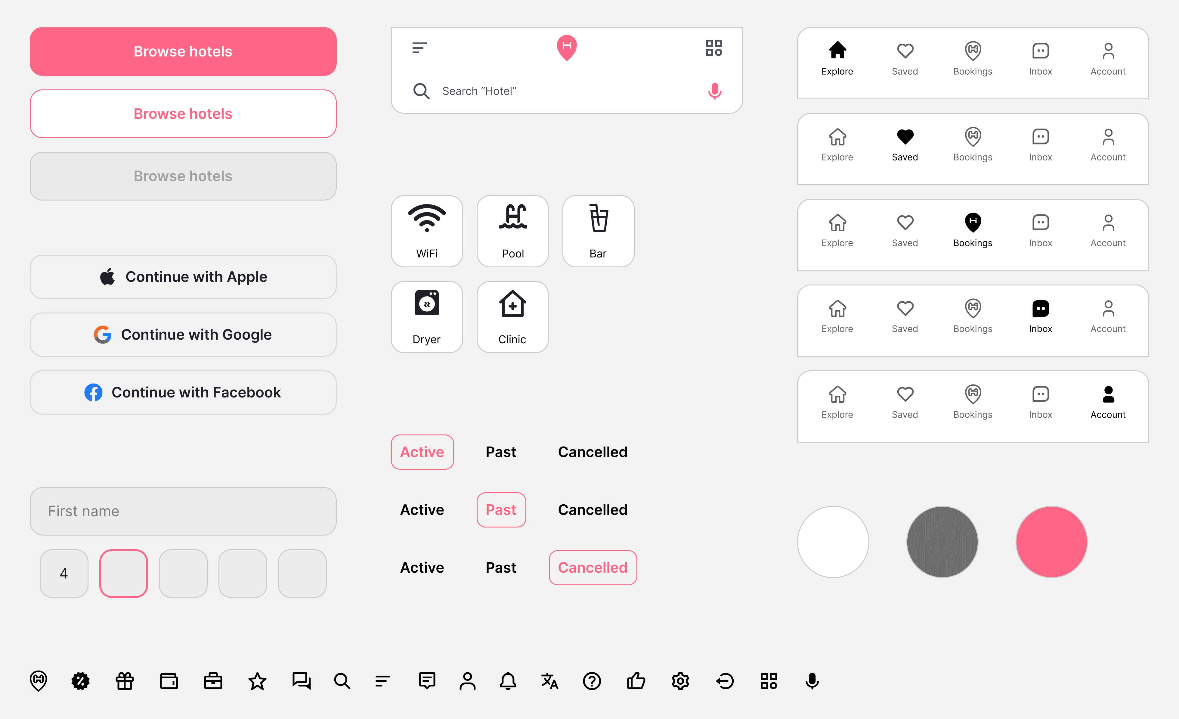
The component library covers everything needed to build and scale the product consistently:
Buttons: primary, secondary, ghost
Input fields and search bar with location pin and voice input
Feature tags: WiFi, Pool, Bar, Dryer, Clinic
Navigation bar across five active states
Booking toggle states: Active, Past, Cancelled
Register buttons: Apple, Google, Facebook
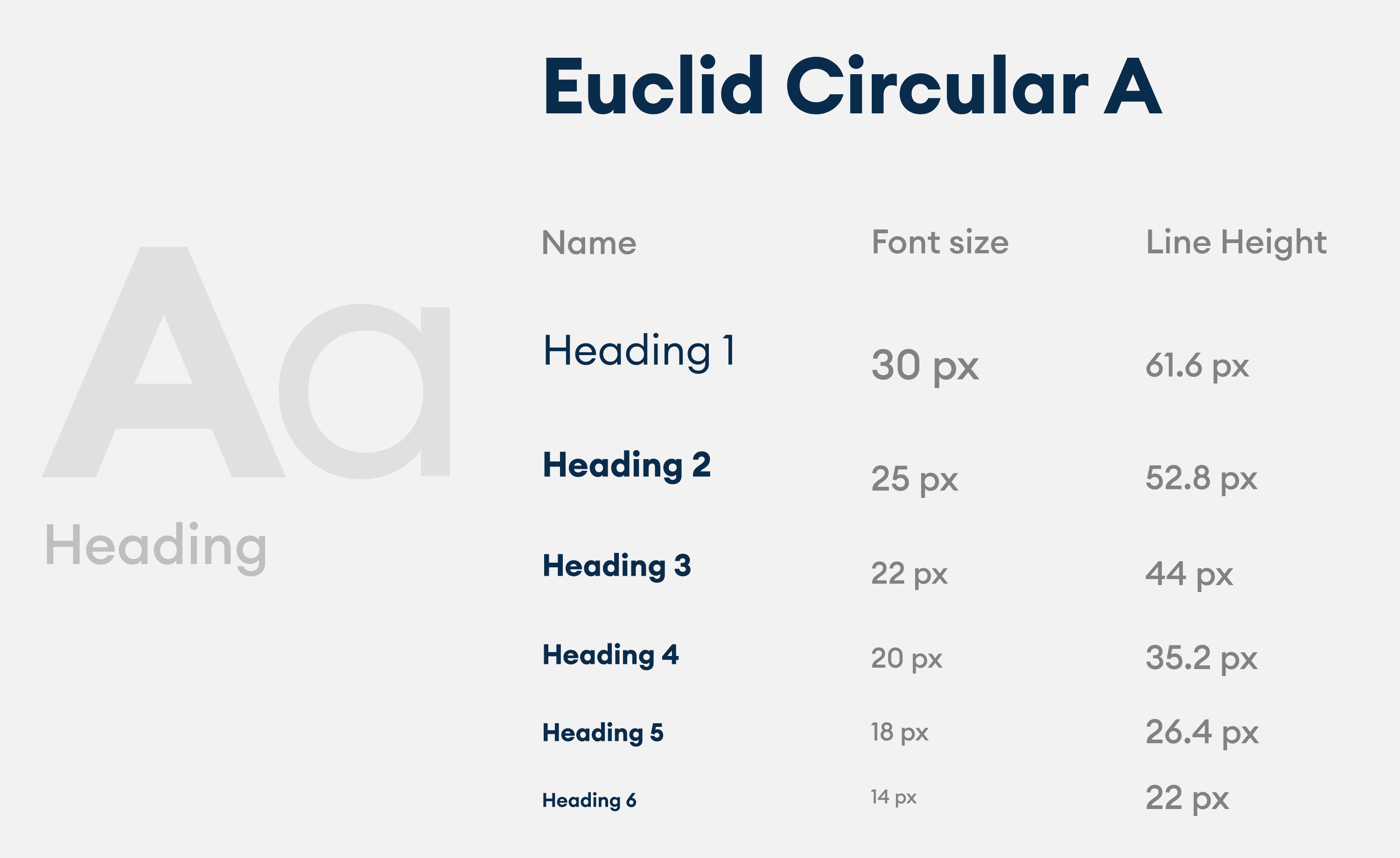
24px custom icon set