Once the avatar existed, the interface had to get out of its way.
Early explorations had persistent control panels, visible toolbars, and labelled buttons for every action. In practice these competed directly with the 3D canvas. Users were reading the interface instead of looking at the garment, which was the opposite of what the experience needed to do.
The direction we settled on was contextual controls. Nothing was permanently visible except the canvas and the garment. Controls surfaced when users interacted, hovered, or needed to take a specific action. Labels were reduced. Motion did the work that text had been doing.
This required close collaboration with the CTO and developers to understand what was technically feasible inside a browser plugin without killing performance. Some ideas got cut. Others got simplified. The final interface was quieter than any of the early explorations and more usable for it.
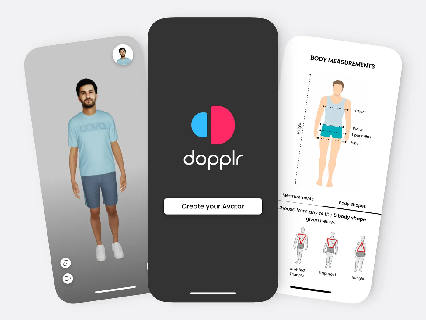
The heat map was the most technically interesting surface to design and the one with the most ways to go wrong.
The data it needed to show was genuinely useful: where the garment was tight, where it had room, where it might cause discomfort over time. But a persistent color overlay on top of a 3D garment is visually aggressive. It competes with the fabric texture, flattens the depth of the render, and if the color scale isn't carefully considered, it reads as alarming rather than informative.
The decision was to make it optional. Off by default, one tap to activate, easy to dismiss. The color scale was tuned to be readable across different skin tones and garment colors, which required several rounds of testing across different combinations. The overlay needed to feel like additional information, not an alarm.
3D assets take time to load. That's unavoidable in a browser environment, especially for a plugin that had to work across different ecommerce sites with varying performance conditions.
Rather than masking this with a generic spinner, I designed loading states that reflected the product's visual language and gave users a sense of what was coming. The motion wasn't decorative, it was communicative. It told users the system was working, what it was doing, and roughly how long it would take.
This thinking carried into micro-interactions across the product as well. State changes were animated. Transitions had direction and purpose. The goal was a product that felt responsive and alive without ever pulling attention away from the 3D canvas.
What this project gave me that nothing else has is the experience of being the only designer at the table from day zero. Every decision about how the product worked, what it prioritized, and how it talked to users came through me. There was no senior designer to check with, no existing patterns to follow, and no room to wait for more information before moving forward.
Designing a 3D experience for the browser in 2022 also pushed me into territory that standard UI work doesn't touch. Performance constraints shaped interface decisions. Technical limitations changed what was possible. Working directly with the CTO meant learning to speak in terms of feasibility, not just desirability.
If I were doing this again, I'd push harder on user testing earlier. Most of our validation came through internal demos and CEO and CTO feedback, which was useful but limited. Getting the avatar creation flow in front of real shoppers sooner would have surfaced friction points we only caught late. That's the thing I'd change.